The Art of Infamous: Second Son - grounding fantasy in realism
John Robertson talks graffiti art, Seattle as a character, and the style of military oppression in the PS4's best-looking game so far.
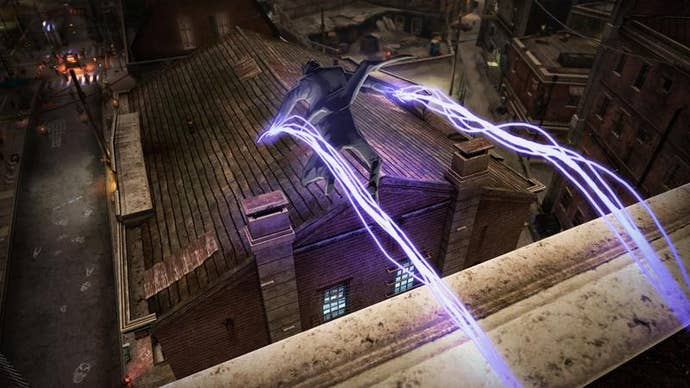
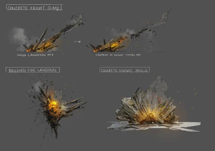
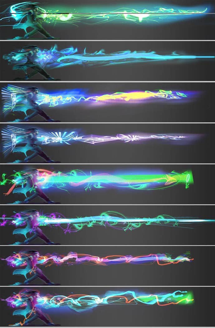
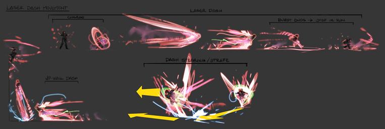
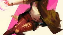
"I don’t know how a guy could turn into trails of light and run up a building, but it feels great and looks amazing in our game so we put it in."
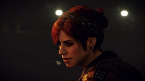
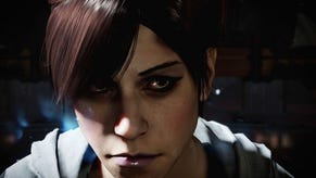
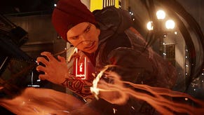
Second Son's visual cohesion and clarity is, arguably, among other commendable elements, its most powerful and charming hook. From surly protagonist Delsin Rowe himself to developer Sucker Punch's use of artistic license to recreate real-world Seattle in digital form, each of the game's aesthetic elements (audio included) comes together to form a visual playground that is both believable and engaging.
This is no easy task considering Second Son's narrative revolves around the existence of super-powered humans and the oft-misplaced fear that surrounds them. The game's world is at once realistic and fantastical, offering a recognisable foundation in which to indulge the common dream of possessing wholly impossible abilities and doing with them what we will.
It's no surprise then that Second Son's art director, Horia Dociu, cites getting that balance between portraying reality and fiction as one of the most difficult tasks for him and his team to get right.
"Crossing that line [of balance] is different for everyone because we all have things that we don’t believe in," Dociu tells me. "From day one, however, we knew the game was about super-powers and the joy of being super-human. So we wanted to spend our 'non-realistic points' on something that would make the game fun. I don’t know how a guy could turn into trails of light and run up a building, but it feels great and looks amazing in our game so we put it in.
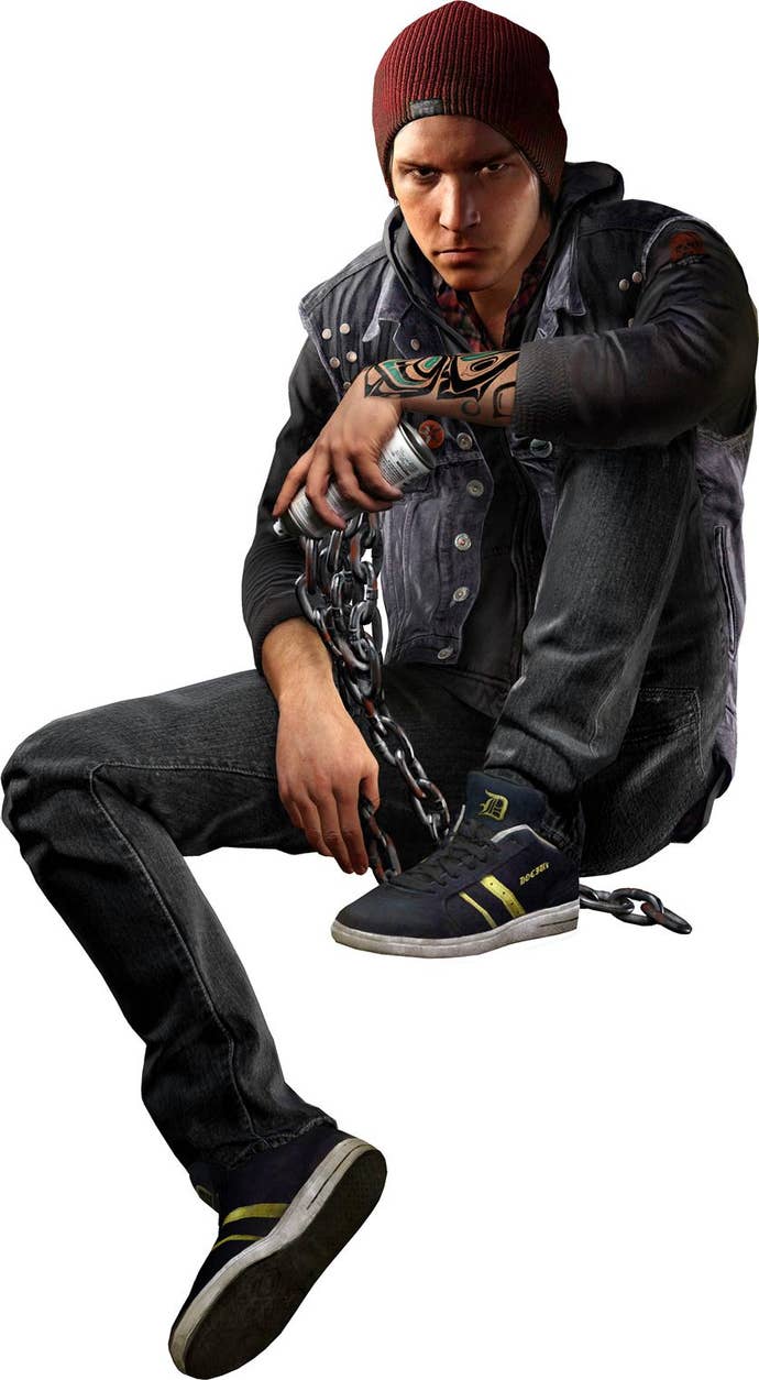
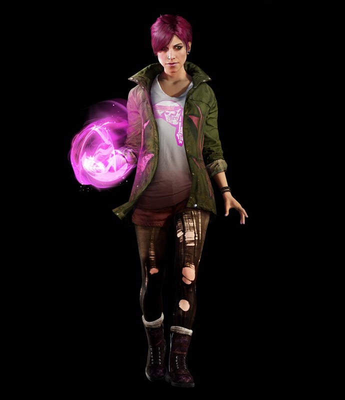
"A lot of the believability from the game also comes from what we leave out. We don’t have ghosts or aliens, super-powers are the only ‘strange’ thing that is different between our world and Delsin's. The enemies are a government agency that was created to deal directly with super-humans, and all of the fictional things you come across have their roots in super-powers. We also made the distinction that it’s a real city and a realistic world, so there are no superhero spandex costumes in our game. Delsin is, more or less, a regular guy."
Delsin is a 'regular guy' in the same way that Second Son's Seattle in a regular city. At surface level both are representations of what we might expect to encounter in our day-to-day lives, but you don't have to look far to see how they deviate from that exception. With Delsin the deviation is obvious: he has super powers to play with. With Seattle the changes are more subtle, designed to embellish and facilitate what we, the players, expect from a videogame world.
The way neon shines off of the impressive water effects, the stark distinction in architecture and style between different areas of the city, the position of key buildings to allow them to be seen (for the most part) no matter your location at any given moment. All of these elements change what would otherwise be a 'standard' environment into something more exciting and immediately appealing.
Dociu refers to these embellished elements as the city's 'character', design approaches that take it to a heightened level of distinction.
"Stencil graffiti was a great fit for Delsin’s attitude, because a lot of well-known street artist are actually activists and social commentators with [the same] disrespect for blind authority."
"We certainly use lighting and environmental storytelling (an abandoned cop car, burning debris) to inform the mood of our more scripted sequences, but for the most part the player is on his own to explore the city," Dociu explains.
"That’s why it’s important that the city itself has a lot of character. The team took hundreds of photos here in Seattle so that we could capture the vibe of all the different neighbourhoods. Something I tried to push for was making each district more distinct by doubling down on its main theme."
Editing the real Seattle in this way is not done purely for aesthetic reasons, however. By creating these palpable themes within the playing space the player is able to more effectively engage with their arena.
"Our Pioneer district, for example, is populated with only brick buildings and historical structures," continues Dociu. "We avoided placing any modern apartments in there to have more segregation of style in the city to help with navigation and progression for the player.
"From the very beginning, we were looking to create a jungle gym custom built for enjoying your super-human powers. We used Seattle to inspire the architecture, weather, lighting, materials and numerous local businesses and references that help marinade our game with a feeling of believability. However, the layout and scale relationships of the city were all designed around Delsin’s super-human move set.
"If we had to rip some balconies off of an apartment to make it easier for the player to climb, or adjusting the roof angles so Delsin can run smoothly across building tops, we didn’t hesitate to make those changes. The game should look real yet it shouldn’t be a hindrance to the player’s enjoyment of expressing their super-powers."
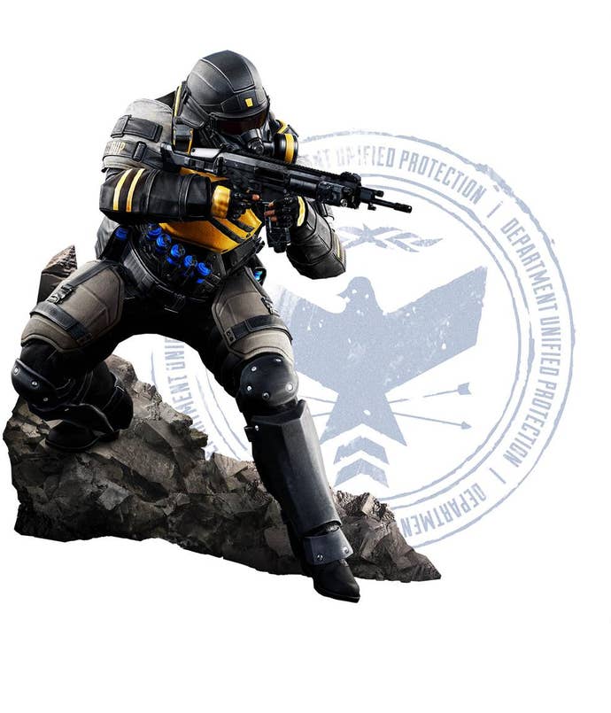
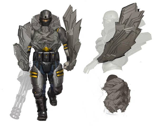
As you'll be all too well aware if you've played Second Son, spread throughout the city are the forces of the DUP, a government funded special forces unit with the singular goal of oppressing and, in some cases, eradicating Delsin and his super-powered peers (dubbed: Conduits).
The DUP are not native to the city, they arrive only when Seattle shows signs of harbouring a more-than-acceptable number of Conduits. With that in mind, it was important that the DUP look and feel like an extra-curricular addition to the 'normal' Seattle. They needed to look as though they didn't belong there.
"It was important for all the lookout towers to appear like a blight on the city. Like a spreading cancer, stifling the city."
"From early on we knew that Seattle would be taken over by an occupying force," Dociu says when asked about the visual identity of the DUP. "So, I thought it was important for all the lookout towers to appear like a blight on the city. Like a spreading cancer, stifling the city.
"The equipment the enemies use is definitely inspired by what would actually happen [in such a scenario]. We looked at army camps as well as concert roadie rigging to imagine something that looks like military, but could also be erected in a city very fast."
Delsin is the antipathy to these enemies. Where the DUP are the embodiment of unchallenged authority and stifling obedience, Delsin is anarchic and not shy about voicing his views on this force's approach to citizen control.
One of the more obvious ways in which he attempts to undermine the DUP's grip on the city is through stencil-based graffiti art, which the player can choose to paint or not paint as they fit. As Dociu describes, graffiti art has long been a means for those disillusioned with society to publicly vent their frustration, anger and desire for change:
"The stencil style made famous by Banksy and other modern street artists is certainly one we took inspiration from. We thought that it was a good way for Delsin’s tags to stand out in relation to the graffiti that’s already plastered all over Seattle when the player gets there.
"It was a great fit for Delsin’s attitude too, because a lot of well-known street artist are actually activists and social commentators with [the same] disrespect for blind authority that we wanted to imbue Delsin with.
"We began working on this title before PS4 existed. In those early days our dev kits were basically 'kit-bashed' PCs that were tuned to the projected power of the PS4."
"Furthermore, we let that street art stencil style influence our 2D animated cinematics that happen when Delsin gets a glimpse into other super-human minds when he drains their powers. We thought that it’d not only be visually striking, but also it makes sense for Delsin’s imagination to be seen through the lens of the art style he practices. It’s always good to try and tie things together like that to make things feel like they have a purpose."
Just how things would tie together wasn't clear when Sucker Punch first started work on the game, not least because the team started design before the PS4 was a physical entity.
"We began working on this title before PS4 existed," Dociu confides. "In those early days our dev kits were basically 'kit-bashed' PCs that were tuned to the projected power of the PS4. So we didn’t know exactly what to expect from ourselves, except that we wanted the game to look amazing. In early production, we worked on just one street in Seattle and threw everything we could at it.
"Without worrying about real-time performance, we built in all the detail we could and worked with our programmers to create gorgeous reflections and hyper-realistic lighting. The result was beautiful, and we spent the rest of our development time ensuring that the entire city would not only look that good, but also run at 30fps. I’m happy to say we achieved that, and it’s got everything to do with the power of the PS4 allowing our team’s potential to come out."
