Ocarina of Time "beautifully remade" for 3DS - Keza goes hands-on
My first experience with the 3DS was in July, back at Nintendo's UK showcase at the top of a very tall building on the Thames. It was a landmark moment; I've not felt like I did when I turned up that 3D slider for the first time since my introduction to the original iPhone touchscreen. It's a moment where technology feels like magic.
The second time I laid hands on a 3DS, circumstances were rather less favourable. As Street Fighter legend Yoshinori Ono so elegantly put it, I was in a giant, cold shed in the middle of nowhere. Like everyone else, I'd been up since stupid o'clock in the morning and had been forced to sit through a press conference in which nothing was announced for fifty minutes. I had to fight with about 1,300 other people in order to get hands-on time with anything. But seeing one of my favourite games beautifully remade in 3D honestly made it worth the pain.
I'm hardly alone in my love for this series, nor am I under any illusions – Nintendo could throw Zelda fans practically anything and we'd still lap it up. Happily, The Legend of Zelda: Ocarina of Time 3D isn't the glorified tech-demo re-release that it could so easily be. It isn't a straight port, nor an emulated ROM like the Master Quest versions for the Gamecube. It's a real remake, updated with better touch-screen controls and given a makeover that goes beyond the purely superficial.
The art style has been redone in Skyward Sword-reminiscent colours, doing away with the N64's sharp polygons and strange, angular landscapes, but it's still true its source. Although Ocarina of Time's original artistic direction was partly the result of restrictive technology, it still had an abstract beauty that this remake thankfully preserves. It looks much, much better without betraying the original stylistic vision.
There are three things that make the 3DS the ideal platform for an OOT remake in my eyes: the circle pad, the touch screen and, naturally, the 3D. A DS version would have needed a radical overhaul to accommodate the game on a D-Pad – Super Mario 64 managed it admirably, but not everybody got on with that thumbstrap, and its conspicuous absence from subsequent Nintendo titles suggests that even the creators knew that it wasn't the most brilliant idea. Simultaneously, the touch screen allows for subtle, natural-feeling improvements to things like item selection.
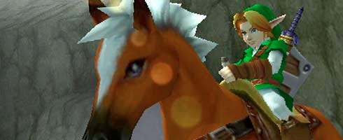
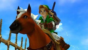
The 3D, meanwhile, lets you see the game with new eyes, even if they're things you've seen a hundred times before – like that iconic intro sequence where Link and Epona ride across the vast expanse of Hyrule Field as the dawn sun rises in the background, which, thanks to the 3D effect, is as strikingly beautiful this time around as it was twelve years ago. God, that intro sequence was a wonderful thing. If you're ever suffering from gaming ennui, put this on and see if it doesn't make you feel better.
The demo offers three five-minute slices from early in the game: exploring and socialising in Link's native Kokiri Forest; the beginning of the first dungeon, Inside the Deku Tree; and a fight with that dungeon's boss, the one-eyed tarantula-like Gohma. They've been selected because they show off the 3D in different ways – in the forest, sparkly particles float around in the air in front of and behind Link as he moves around. Text, the map and button prompts are all static in the foreground whilst the forest itself stretches out ahead of you.
Navi the fairy flies in and out of the screen, circling people and things and enemies of interest (she doesn't seem to shout 'HEY! Listen!' with quite such irritating frequency, but then it's difficult to hear the game that well in a room full of so many people). In a more dangerous place, the Deku Tree, the 3D makes Deku Baba plants lunge out towards you or shrink away from your sword. Z-targeting is now mapped to the R-button, and it's still one of the best combat systems in gaming.
This first dungeon is as familiar as the back of my hand, and nothing much has changed. Little Link is still captivating in his childishness, opening small chests with a little kick and plunging head-first into the bigger ones to emerge with a vital trinket – another beautiful showcase moment for the 3D effect. After a few minutes, the Catapult makes his first appearance – in first-person, you can aim at wall-crawling Skullwalltulas by tilting the console around, using the gyroscope. Here, the sense of depth makes a tangible improvement to the actual gameplay.
The touch screen, too, improves things noticeably. In the first dungeon, there aren't really enough different items to choose from for the touch-screen to be essential, but later on it'll make life so much easier. As Eiji Aonuma famously mentioned, being able to switch in and out of the Iron Boots without going through two menus in the Water Temple will remove one of the N64 version's biggest game-design frustrations.
It was never really in doubt that OOT 3D would be a faithful and beautiful remake of one of the best games ever made. There are cosmetic and interface improvements, but remarkably, the game itself still feels modern, and the flawless design philosophy at its heart doesn't need improving. Ocarina of Time is now twelve years old; a huge portion of the 3DS' audience will never have played it before, and this will doubtless introduce the game to a new generation of enraptured new Nintendo fans.
But the question for the rest of us is, would you pay £40 for a game you've already played? I would, obviously, because it's this game, and Zelda is the most important series in the world to me (I've got the tattoo to prove it), but I'm sure not everyone would. Beyond the initial novelty of the 3D – which shouldn't be underestimated – there's nothing new here, and though there's no shame in nostalgia, Nintendo must not rely on remakes for killer apps. Still, at the very least, the quality of this remake makes me very, very excited about the potential for an entirely new 3DS Zelda.
